
by Mark A. Semich
|
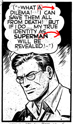
Currently, we have only one full-size page of the original K-Metal artwork: page 20.
In order to restore the letters in the remaining original pages and to letter our own new pages in a matching style, a new font was contructed using the letters from that page. Every letter of the dialogue and narration was searched for the most representative and aesthetic version of that letter. For example, the letter 'A' appears multiple times on the page, so every 'A' was examined. Since the original artwork had been lettered by hand, each 'A' was unique, but they were all very similar in appearance. The chosen version of each letter was then scanned at 600 dpi and used as the source for the contour definitions of that letter in the font. | |
Each letter was extracted from the original 1940 artwork |
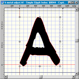
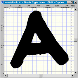 On the left is the resulting 'normal' letter A; on the right is the 'bold' version. |
|
The handful of letters that do not appear on page 20 were constructed using the original artwork for page 12 as a source. Although our copy of page 12 is not as good as our copy of page 20, it sufficed for this purpose. The size of each letter was then adjusted to ensure that all of the heights and depths of all of the letters matched. 
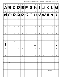
Partially completed template for the 'normal' K-Metal font and for the 'bold' K-Metal font. Every kerning pair was adjusted to ensure proper spacing between the letters. 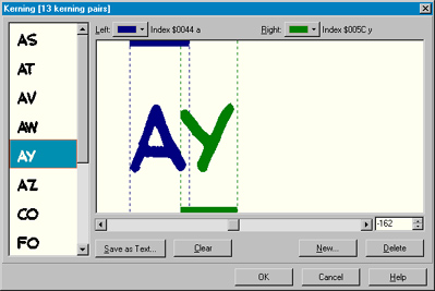
The K-Metal font, now complete, can be used for restoring the letters to the original pages and for lettering all of our new pages in a manner that flawlessly matches the 1940 artwork: 
Article, font creation, and story lettering by Mark A. Semich | |

